quick tutorials
the rising tide
When I redesigned the Westciv site (some time ago now - how it flies!) I included a neat little effect on the top left corner logo which I like to call "The Rising Tide". Scroll up and down the page a bit now if you've never actually noticed it before.
(Not seeing anything in particular? I'm guessing you're using Internet Explorer on Windows. Because a vital aspect of CSS is not supported by this browser, the technique doesn't actually work here. However it does no harm either, so in the spirit of progressive enhancement I decided to use it anyway.)
I've always been surprised by the number of people who have written in asking how the effect on the logo works, and now I've finally got round to writing a little tutorial to spell it out. There are two parts to the technique. One is simply the scrolling effect, and the way the westciv logo can always be seen no matter how far you scroll down the page. And then there is the fact that this logo is a live link to the Westciv home page, available right there in the top left of the viewport, no matter how far down the page has been scrolled.
The scrolling effect on the logo
First up you need two different background images. Mine look like this:

banner.gif - used on #header
page_bg.gif - used on the <body> element
I've shrunk these down a bit from the actual ones I use so that I'll be able to use them here to demonstrate the technique. When you create your own two images you just need to make sure the patterns and the logo appear in exactly the same place on each image. For the effect to work only the color must change.
Now, in your HTML you're going to need two elements, which will be positioned to sit on top of each other when the page is rendered in the browser. Try to avoid creating elements purely for the purpose of achieving visual effects. In my case I used the <body> element and <div id="header">. These elements already have a semantic and structural purpose in the markup, now I'm just adding a visual effect.
These two elements are then positioned as follows on my page.
body {
margin: 0;
padding: 0;
}
#header {
width: 100%;
margin: 0;
padding: 0;
}
If you view the full source to any page at our site you'll see that #header is the first element contained by the <body>. As it has no margin or padding then, its top left corner will be exactly the same as that of the <body>. Then we give both these elements a background image (and background color appropriate to this image), and make those images not repeat, like this.
body {
...
background-image: url(images/page_bg.gif);
background-repeat: no-repeat;
background-color: #fff;
}
#header {
...
background-image: url(images/banner.gif);
background-repeat: no-repeat;
background-color: #091c5a;
}
Then the top left of those two images will be in the same place, ie the top left of the page, with #header's image on top of the <body> element's image. At the moment then, as both images are the same size, you won't actually see page_bg.gif at all because banner.gif is on top of it.
But you don't want #header to be the full height of this background image anyway. The height of #header on the Westciv page is determined by its content: you'll notice how it grows and shrinks according to the font size used for the page. So, once you place some content in #header, and then maybe put another element on the page which flows on after it (in our case this is #content, which contains all the text on the page as well as the right side navbar), you'll see page_bg.gif appear where #header finishes. With the images I've used the effect works best if you have a border on the bottom of the header.
#header {
...
border-bottom: 1px #ff5800 solid;
}
The size of #header will grow and shrink according to your text size, but no matter where its bottom border is it will seem to blend seamlessly with the <body> element's background. All of this you've seen so far also works in Internet Explorer.
At the moment though when you scroll the page both images just scroll away too, just like a regular page. But what happens then if you apply background-attachment:fixed to the <body> element?
body {
...
background-attachment: fixed;
}
OK, now as you scroll down the page the blue Westciv logo on the white background remains in view, but you don't get the kind of rising tide transparency effect as #header disappears from view. In fact, if you look closely when #header is "half-gone" the effect isn't so nice at all: there's a disconnect between the image on top and the image on the bottom. Again, this is what you see on Internet Explorer even when the page is finished, as the following is not supported.
Did you know that you can apply background-attachment:fixed to elements other than the <body>? And a fixed background image is fixed with respect to the viewport (not the element with which the image is associated). This means that wherever the image's top left corner starts, it remains there as the page scrolls. So add background attachment:fixed onto #header as well.
#header {
...
background-attachment: fixed;
}
This will mean then that as all the content on the page scrolls by (and out of view in the case of #header's content) while any of the header element is showing, you'll continue to see its background image, with its top left fixed in the top left of the viewport. So that's how you get the effect of the scrolled content appearing to rise over the top of the image.
The Link Effect
For a long time I left the site like this. But it always bothered me that people would assume that the logo would be a link back to our home page, and click it accordingly. In fact, it wasn't a link at all. Indeed there wasn't even any content on the page there to link to.
Then one day I worked out what to do about it, by making use of the link in the top navbar which is already linked to Home. Now, this technique is a little bit naughty in semantic terms, as it requires you to add in an extra empty <span> element with no semantic value. Like this.
<li><a href="../../index.html">home<span></span></a></li>
Even though it is empty, this element can still be given a position and a width and height. We're going to do this, placing it over the top of where the Westciv logo is. Remember this logo is always in the same place relative to the viewport, so we'll want to apply fixed positioning.
Luckily, we can keep unnecessary code to a minimum by selecting the <span> using a descendent selector.
#header a span {
position: fixed;
left: 15px;
top: 6px ;
width: 61px;
height: 54px;
}
Style Master's X-Ray feature was really handy for getting the position and size of the <span> just right. Remember, it has no content so you can't normally see where it is on the page. But in Style Master, with X-Ray turned on, it was easy to see exactly where it was in the Design Pane and then tweak its coordinates until it was exactly over the top of the logo.
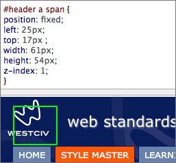
Using the Design Pane to position the <span>
Here's the magic part. Remember the <span> is inside a link. What this means is that even though it has been positioned right away from that link, ie, it's no longer even connected with it on the page, it still remains "live" and linked to the same thing. And the best part is that because its position is fixed, as you scroll down the page, it remains positioned right over the top of that westciv logo which is also fixed there. I think this is really cool, as it means no matter how far down you have scrolled on the page, even when that top navbar has long disappeared, you still have a link back to the home page.
Sadly, position:fixed is not supported on Internet Explorer, so users of this browser are left to find their own way home.
Finally, you do need to also set the z-index on a few elements on the page or you could run into some trouble. You want the linked <span> to always sit on top of #header, so give #header a z-index of 0, and the <span> a z-index of 1.
#header {
...
z-index: 0;
}
#header a span {
...
z-index: 1;
}
But after this all the content on the Westciv page is inside <div id="content">. This is set up so that on wider screens (1024 x 768) there will be "whitespace" on the left hand side, and these users will see the westciv logo, and be able to click on its link. However, as the viewport becomes narrower on a smaller screen (say 800x 600) #content moves closer and closer to the left hand edge, covering up the logo. You don't want that clickable area to be there if people can't actually see the logo though. This is easily fixed then by giving #content a higher z-index than the <span>, which means it will always sit on top of the clickable area.
#content {
z-index: 2;
}
And as Ed Wood would have said, "that's a wrap!".
Got any comments about this technique? Feel free to post a comment about it at the blog.