style master css tutorial
More text properties
In this section you will learn
- justifying text using the
text-alignproperty - italicizing text using the
font-styleproperty - the
letter-spacingproperty - underlining using the
text-decorationproperty - more practice with ems using the
line-heightproperty
Project goals
- add some special styles to make the headings stand out more from the main text
- make the text in the paragraphs look more clean and attractive
<< 5. page appearance | 7. class selectors >>
Justification
The text-align property controls the justification of text. It can take one of the following values, which hopefully should be pretty self explanatory to anyone who has ever used a word processor.
leftrightcenterjustify
Exercise 16
Make all level 1 headings right justified
We could go to the trouble of using the editor to right justify <h1> elements (it's on the Text Editor), but the makes simple properties like this even easier. On this editor you'll see some buttons that will be familiar to you if you've ever used any sort of text editing application. Can you work out which one to use if you want to right justify the text? Just make sure your cursor is inserted in the h1 statement, and click this button.
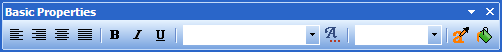
Figure 8: Core Properties Editor
A lot of the basic text properties we cover here can be found on the . If you can't see the , click its button on the toolbar.
h1 {
...
text-align: right;
}
Italicization
Here's another very straightforward property that I'm sure you can work out how to use in no time. The property is actually called font-style and the value you want to set it to is italic.
Exercise 17
Italicize all level 1 headings.
You'll find a button for this property on the . It's the same button that's used to italicize text in regular word processing applications. Click this while you've got the cursor inserted in the h1 statement and you're in business.
Have you been saving and checking in the browser as you go?
h1 {
...
font-style: italic;
}
The letter-spacing property
Along with the basics we've seen so far, CSS also gives you properties that can suddenly make plain text appear quite stylish indeed. One that I like to use in particular for headings is letter-spacing. This property takes the same sorts of length values we saw for the font-size property. For letter-spacing though, instead of ems, I prefer to use pixels.
Exercise 18
Set the letter-spacing on <h1> elements to 5 pixels.
You'll find the letter-spacing editor at the top of the .
Remember how to set length values? All you need do is set the right side popup menu to px, and type 5 in the field.
h1 {
...
letter-spacing: 5px;
}
Check the effect in your browser: nice isn't it?
The text-decoration property
Now, what about level 2 headings - we haven't done anything to them yet. How about we keep it simple and just underline them. We do this using the text-decoration property. This can take any of the following values. Note that these aren't mutually exclusive: for example these's no reason why text can't be both underlined and overlined. If you ever use more than one value just separate them out using spaces.
- underline
- overline
- line-through
- blink
- none
Exercise 19
Make all level 2 headings underlined.
If you only want to underline an element all you need do is click the underline button on the toolbar. But if you need to use any of the other values for text-decoration you'll find the full editor for this property on the .
h2 {
...
text-decoration: underline;
}
OK, that's all the heading levels styled. Let's have a look at paragraphs.
Making text look clean
Stylish looking web sites do a couple of things to create their special appearance. Some of these are not always the 100% best solution in terms of accessibility, but this is a trade-off that will almost always be on your mind as a web designer. Use the following couple of techniques at your discretion.
One thing I like to do to really clean up the appearance of text is to fully justify it - so that each line stretches to fill the entire block - as text normally does in a book, a magazine or a newspaper. Try this effect and see whether you like it.
Exercise 20
Make the text in all <p> elements fully justified.
Now might be a good opportunity to introduce a feature of Style Master that can save you a lot of time by allowing you to edit the CSS directly from the preview. It's called X-Ray matching. First, you want to make sure it's turned on.
To turn on X-Ray matching
First, make sure you can see your preview document in the Design Pane. In fact, you might want to set up the page so you can only see the Design Pane, and none of the style sheet text, by grabbing the top of the frame around the Design Pane and dragging it up until it covers all of the style sheet text.
1. Make sure from the menu is ticked.
2. You might also want to tick from the menu. This isn't necessary, but it helps you see what is going on more easily.
Now, click around in the Design Pane and watch what happens in the Statement List. You'll see different statements in the list are highlighted: Style Master is telling you which statements select the elements you are clicking. One of the statements will be highlighted a different color. This statement is now selected and ready for editing.
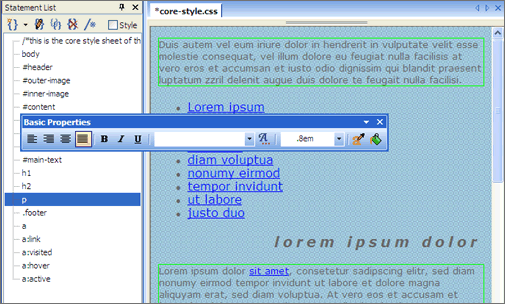
Figure 9: Editing using the Design Pane
Why don't you try justifying the paragraph text in this way?
1. Click any paragraph in the Design Pane.
The p statement will become selected in the Statement List, but notice too that in the Design Pane itself, all <p> elements are now highlighted. This is showing you that any changes you make will effect all of these elements.
2. Click the Justify button on the Core Properties Toolbar.
You'll see the change take effect in the Design Pane, and if you have a look at the code (just slide the Design Pane down to reveal it), you'll see that text-align: justify will have been added to the p statement.
I've just shown you a really straightforward application of this Style Master feature. There's a lot more you can do with it. When you're done with this tutorial you might like to read some more in the FAQ.
Did you work it out?
p {
...
text-align: justify;
}
The line-height property
Look at the text in a browser window now. I think you'll agree it's a little difficult to read. The lines of text are very wide at the moment. That will change when we do the page layout in a little while, and this will have a very noticeable effect. But we're going to do something now as well that will also improve readability.
The line-height property, for those of you familiar with old typesetting terminology, is the equivalent of leading. It allows you to put more (or less for that matter) space between the lines of text than is the default for the font. You can use the usual length values that you've seen before for font-size and letter-spacing. If I'm using ems for font-size I like to also use ems for line-height. This way as the user's preferred font size increases the drawn font size and the space between the lines will increase proportionally to one another.
Exercise 21
Make the line-height in all <p> elements 1.7em.
You'll find the line-height editor on the Text Editor.
Once you're done check it out in the browser. Even on the too-wide page, it looks a lot better doesn't it? Be sure to watch what happens too as you increase and decrease the preferred font size. Of course, you'll want to experiment and develop your own preferences, but I find this combination (a font-size of .8em and a line-height of 1.7em) works really well.
p {
...
line-height: 1.7em;
}
Next we're going to style the footer at the bottom of our page, learning a new selector in the process.