articles
The layout is dead, long live the layout
Abstract
Author: Maxine Sherrin
History: First published at Joe Gillespie's WPDFD July 2001.
There are many good reasons not to use tables to create web page layouts: unnecessarily complication code, they defy the most basic rule of information storage and retrieval by mixing content with appearance, they destroy logical document flow, and most of all, they were not a tool which was created to do this job. Why continue using them when CSS has a whole suite of far superior page layout features, with the added bonus of streamlined code, separation of content appearance and caomplete control over logical document flow?
Years ago a web developer called David Siegel thought of a way of creating on the web the kind of layouts designers were used to working with on paper. These layouts fulfilled an obvious need, were an instant success and their use became a sort of standard. The "Killer Web Pages" series which showed us how to do it is now part of web lore.
Not everyone knows though that not very long afterwards, in 1998, David Siegel recanted, writing "The web is dead and I killed it". What did he mean?
The "Killer Web Pages" design technique revolves around the use of HTML tables, and even more egregious hacks such as transparent spacer gifs. Perhaps their greatest benefit is that they allow the development of pages that grow and shrink with window size. Developers have taken this to be the final answer, rather than a bare minimum, of flexible, accessible web page design.
But what Siegel recognized in 1998 was that tables should never have been used in this way at all. It's time that we all recognized this and got on with really designing for the new medium using the correct tool for the job. First let's take a look at why "tables are bad, don't use tables" should be the new mantra.
Tables were designed for the presentation of tabular information. At this, they excel. If your pages present statistics on the average rainfall of the states, birth rates of the different species of orangutans and so on, this is the technology for you.
But tables are not designed for presenting page layout. In fact, using them for this purpose has a number of serious drawbacks, both for you as a presenter of information, and for the people who want to see the information you are presenting.
Using tables for page layout creates very complicated code that is tediously counter-intuitive to develop and often extremely difficult to maintain. This code is unnecessarily verbose, making for long downloads, and slower rendering time for browsers. We've been able to get away with our pages bloating out because we use tables, as the speed of the computer of the average web user has increased. But it's going to become a real issue again when we start developing for wireless devices, as network speeds for these are going to be slow for some time, and their processing power is usually much less than that of the average desktop computer.
Using tables for layout mixes the content of your page with its appearance. This is in direct violation of an important principle of good information design. The actual information you present should be separated from information about how this content should appear. This is what organizations like the W3C and Web Standards mean by advocating the use of "structural HTML", and discouraging its opposite, "presentational HTML".
By using tables to mix the content of your pages with information about their appearance you make these pages much less accessible. How so?
Firstly, table based designs usually depend heavily on assumptions about the particular viewing conditions of a visitor to the site. Issues like screen resolution and size of view port are very significant. Screens that fall outside a rather narrow range of size and resolution usually present challenges to these designs. Content can quickly become inaccessible when resolutions fall outside a particular range, or screens are bigger than or smaller than a certain size. And then those pesky users go and change their font size and the whole design falls in a heap even at your optimal screen size and resolution.
This isn't an academic issue. Increasingly you will not be able to rely on PC based browsers, with 800*600 to 1024*768 screen sizes at a nominal 96dpi.
Secondly, the use of tables destroys logical document flow. The content of the document does not appear in the code in the order in which you would expect a human to understand it. The problem? Information will not always just be read by humans reading from screens. In-car devices will be voice rather than screen based. Devices for the vision impaired are more often voice based. The web is no longer PC based, it's World Wide. Designs which utilize tables inherently limit accessibility by these increasingly important devices.
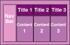
Here is how a table-based page might appear in a web browser
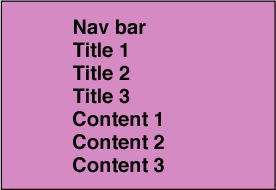
And here's the order in which the content appears in the HTML for that page
For all these reasons, tables are to be avoided for creating layout. But I am not advocating a return to the kinds of (non) designs we saw in the early days of the web. It just means there are plenty of good reasons to stop using this tool that was never made for the job we've been using it for. It's time to start thinking about real web page layout, using the tool that was created for it, the Cascading Style Sheets (CSS) positioning properties.
If you take just a little time to investigate what you can do with CSS positioning you'll see that compared to this now mature and well supported technology, tables provide an almost primitive set of presentational tools. To put this more generally, presentational HTML provides a relatively limited set of presentational functionality in comparison with CSS. At the same time, using CSS allows you to separate content from appearance, create documents that have logical flow, build light weight sites, and reap the benefits of easier development and maintenance, and increased accessibility.
The CSS positioning properties are a broad, extensible and sophisticated set of page layout tools. Using them we can move away from the anachronistic palimpsest we currently think is cutting edge information architecture. Most table driven layouts are really not much more than poor on screen translations of designs appropriate to the printed page. CSS positioning can be used to create this type of design. But much more importantly it enables the creation of designs driven by the possibilities of the web medium, rather than limited by the constraints of paper.
Let's look at concrete example. A current obsession of designers is the multi column layout. An everyday design component of magazines and newspapers, where it meets a very pertinent need: maximising the amount of legible print on a page. Design after design attempts to achieve this on screen. Particularly if you forget Netscape 4, you can make this kind of design work with CSS positioning. This is done using one of the simplest aspects of CSS: the creation of elements that have percentage based positions, widths and heights. But with CSS, unlike tables, you can also use other relative units of measurement. One of the more interesting, well supported, but not widely discussed of these is the em. In a nutshell the use of ems means the size of an element will depend on the calculated size of the text in that element. So, for example, you don't have to take a stab in the dark with percentages, and assume a particular font size (very bad assumption) to ensure that a "column" is no more than 40 characters wide. You simply give it a width using ems and it will grow and shrink according to the preferred font size of the reader.
Even today, with less than complete browser support for all of CSS positioning in Internet Explorer 5 (great in parts, absent in others) and Netscape 6 (much better all round support) you can do so much more than the table paradigm was ever going to allow. You can use the float and clear properties to make text flow around images. You can make objects be positioned not just with respect to the top and left of the page, but also the bottom and right. You can use z-index to place objects on top of one another. Ironically, the tools available in CSS much more closely approximate what we have been able to do for years in paper oriented graphic design environments.
But I'm actually loathe to explain how basically you can use CSS positioning to create the same sort of layouts you've been creating with tables, because I really don't think that's what we should be doing at all. What we need to do is abandon our obsessions with particular effects, of which the multi-column layout is only one, and concentrate on designing page layouts which maximize the accessibility of the information they present.
Tables may provide a relatively useful framework for attempting to emulate printed page design, but they are singularly unhelpful in providing the tools for designing new ways of presenting information particular to the online environment. CSS positioning offers so much more than this that it will be a shame if we continue to waste time looking at the web page through the prism of paper.
Maxine Sherrin is a director at westciv. She has designed the many iterations of the westciv site as well as developed much of its content and that of westciv's self paced courses.